Create a Nested Grid
A nested grid is where a grid item becomes a grid itself. Here's a brief overview and demonstration.
Grid items can become grids themselves with CSS grid layout. You can then place grid items inside the grid item, therefore creating a nested grid.
To create a nested grid, all you have to do is apply display: grid (or display: inline-grid) to the grid item and it becomes a grid. You can also apply display: subgrid to create a subgrid. See below for more information on subgrids.
Here's an example:
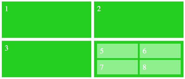
That should look like this in the browser:

Inheritance
Most grid properties aren't inherited, which means that your nested grid won't inherit the values from its parent grid. This allows you to make changes to the parent grid without inadvertently affecting the nested grid.
For example, say you have grid-auto-flow: column on the parent grid but you haven't set this property on the nested grid. In this case the nested grid will be set to row because that's the initial value of that property.
Like this:
Notice that on the parent grid, the numbers now flow vertically down the columns instead of horizontally across the rows, but the nested grid still flows horizontally across the rows.
However, many other CSS properties are inherited, so you won't necessarily have to reset all properties.
Subgrids
The CSS Grid Layout Module defines a subgrid value for the display property. However, at the time of writing, no browser supports this feature.
This should prove to be a useful feature once it's implemented.
A subgrid is a nested grid, but with display: subgrid. This makes it a special type of grid container box that participates in sizing the grid of the parent grid container. In other words, the content of the subgrid affects the sizing of the parent grid, allowing content to align across both grids.
Below is an example of where this could be useful (this is based on an example in the W3C specification).
Here's a list of form elements:
And here's some CSS that sets the list to a grid, and each list item to a subgrid.
This would result in the labels and inputs aligning, and a border placed around each list item. Setting each list item to a subgrid of the list means that there shouldn't be any alignment problems with the form controls not lining up, etc, because each list item will be contributing to the sizing of the parent grid.